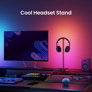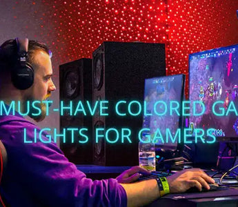
Choose a colour palette by testing the wall, furniture and screen together. Saturated colour is an atmosphere choice, not a replacement for useful white light or a shortcut to better game performance.
Begin with one background colour
Start with a steady colour and observe the room from your normal playing position. Compare it on a plain wall, coloured paint and nearby objects. Objects reflect different parts of the incident light, so the same setting need not look identical on every surface. A colour name in an app cannot predict the whole room’s appearance.
Add contrast only where it helps the composition
Try a second colour on a separate background area rather than making every source compete. Check the screen in dark and bright scenes. If a source is distracting or reflected, reduce its brightness or change its position before adding further effects. There is no requirement to make the room match a fixed red-and-blue formula.
Keep a usable white arrangement
A coloured background may be enjoyable while the keyboard or written notes still need separate task light. White colour temperature and saturated RGB colour are different controls. Check the exact device: colour-changing, adjustable-white and addressable segment effects are not interchangeable specifications.
Choose an effect after choosing the palette
Use a static arrangement as a baseline before trying movement or music response. Light Strip Pro and the catalog’s modular Cube are different product forms; their exact packs and controls need separate checks. For Cube, choose a Cube+Base set to start: an extension is not a standalone kit. Music response is not evidence of direct television-picture matching.